
Canon R-100 | Rec.709
Color Grading | Final
Canon R-100 | Rec.709
Color Grading | Final
ESPECIFICAÇÃO TÉCNICA
Estudo de color grading explorando como a mesma imagem pode servir a narrativas opostas através de escolhas de cor.
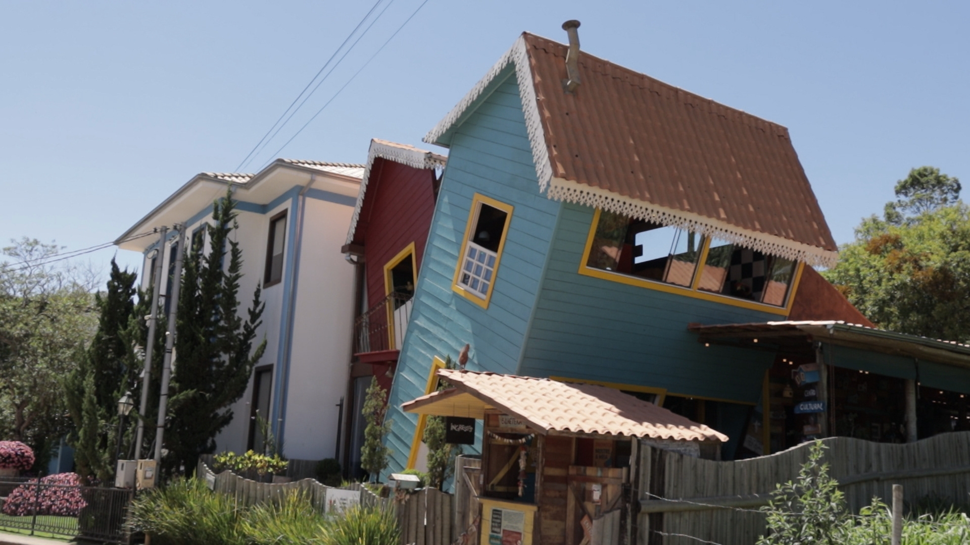
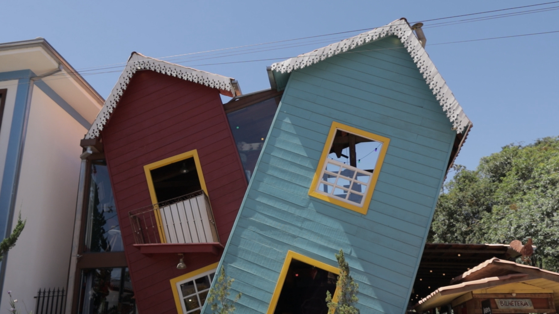
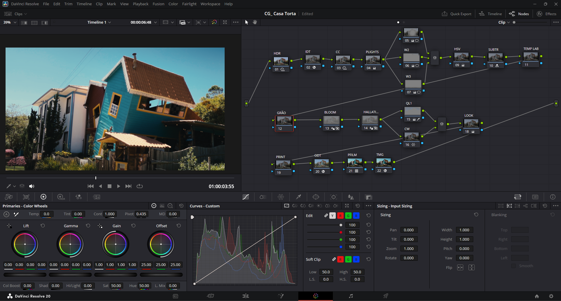
O footage foi capturado na Casa Torta, atração turística próxima a Tiradentes (MG), Brasil — um espaço que evoca nostalgia com sua arquitetura inclinada e acervo de brinquedos das décadas de 70, 80 e 90.
Duas abordagens de grading foram aplicadas ao mesmo material:
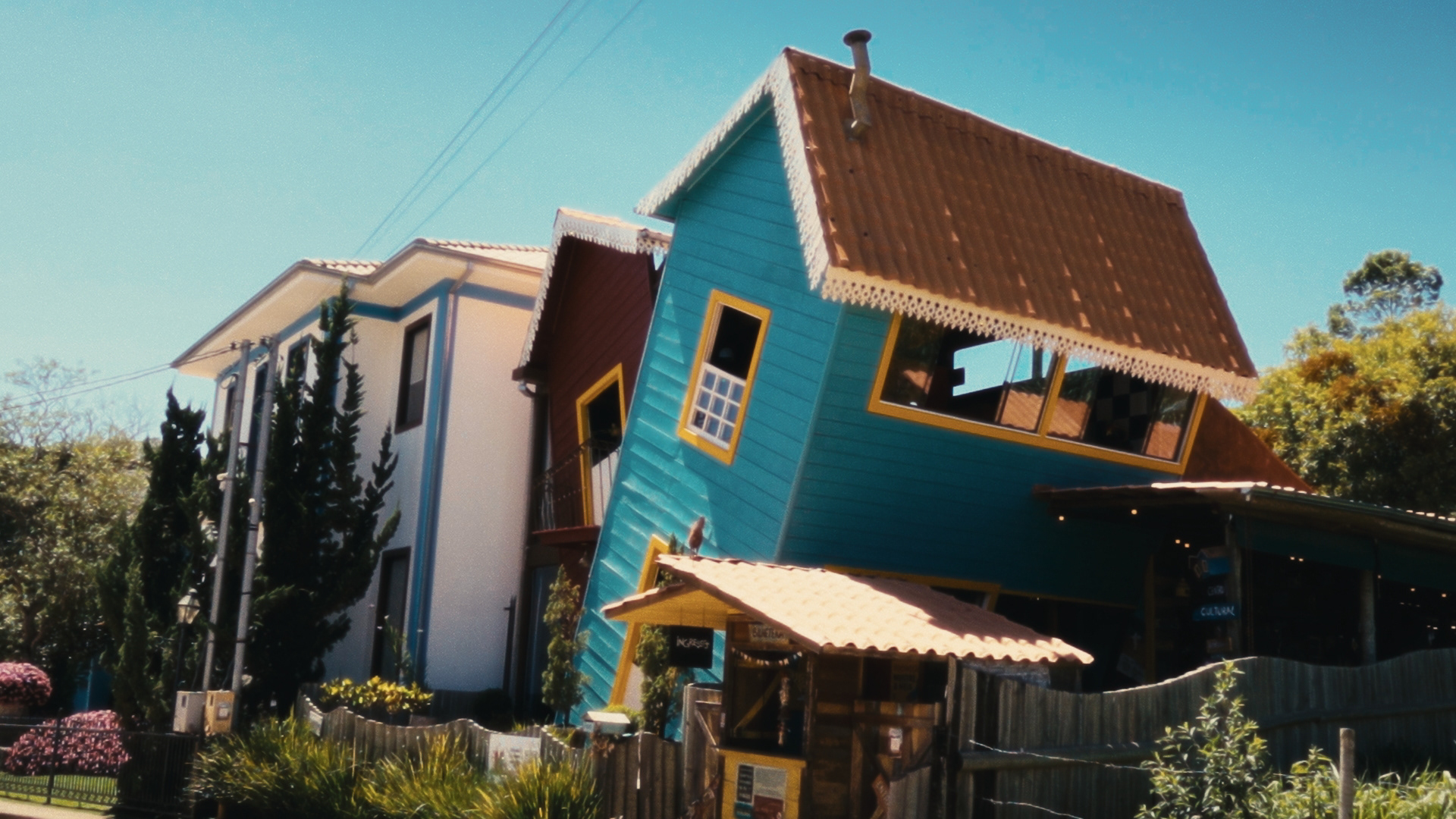
Look 1 — Warm/Vibrant
Saturação elevada, temperatura de cor quente e contraste moderado. O objetivo foi reforçar a energia lúdica e convidativa do ambiente, criando uma atmosfera de memória afetiva viva.
Saturação elevada, temperatura de cor quente e contraste moderado. O objetivo foi reforçar a energia lúdica e convidativa do ambiente, criando uma atmosfera de memória afetiva viva.
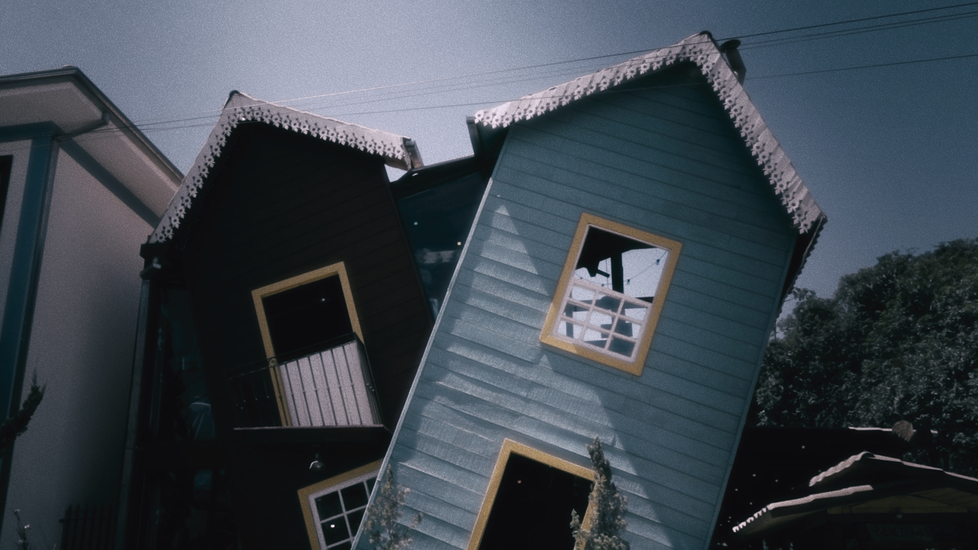
Look 2 — Cold/Desaturated
Dessaturação, temperatura fria e ajustes de lift nos shadows. A intenção foi transformar a mesma cena em uma memória distante, com tom melancólico e contemplativo.
Dessaturação, temperatura fria e ajustes de lift nos shadows. A intenção foi transformar a mesma cena em uma memória distante, com tom melancólico e contemplativo.
Colorista: Rodrigo Barbato
—----------------TECHNICAL SPECS
Camera: Canon EOS R100
Codec: H.264 (MP4)
Resolução: 4K UHD
Color Space: Rec.709
Software: DaVinci Resolve Studio
Workflow: Primary and secondary correction with qualifiers and masks.
Codec: H.264 (MP4)
Resolução: 4K UHD
Color Space: Rec.709
Software: DaVinci Resolve Studio
Workflow: Primary and secondary correction with qualifiers and masks.
Color grading study exploring how the same footage can serve opposing narratives through color choices.
The footage was captured at Casa Torta, a tourist attraction near Tiradentes (MG), Brazil — a space that evokes nostalgia with its tilted architecture and collection of toys from the 70s, 80s, and 90s.
Two grading approaches were applied to the same material:
Look 1 — Warm/Vibrant
Elevated saturation, warm color temperature, and moderate contrast. The goal was to reinforce the playful, inviting energy of the environment, creating an atmosphere of vivid affective memory.
Elevated saturation, warm color temperature, and moderate contrast. The goal was to reinforce the playful, inviting energy of the environment, creating an atmosphere of vivid affective memory.
Look 2 — Cold/Desaturated
Desaturation, cold temperature, and lift adjustments in the shadows. The intention was to transform the same scene into a distant memory, with a melancholic and contemplative tone.
Desaturation, cold temperature, and lift adjustments in the shadows. The intention was to transform the same scene into a distant memory, with a melancholic and contemplative tone.
Colorist: Rodrigo Barbato
THAKS FOR WATCHING!!

Rodrigo Barbato
Colorist | Editor
contato@studioreferencefb.com.br